Let’s clear this up once and for all. If you’ve ever tried to send your label design to a printer and been asked for a CMYK file (only to panic and send the wrong thing), you’re not alone. Or maybe you’ve uploaded something to your website and wondered why the color suddenly looked… off?
CMYK vs RGB is one of those design details that feels overwhelming at first, but once you understand the difference, everything starts to click. Especially if you’re running a product-based business where color is part of the experience.
In this post, we’ll break down CMYK vs RGB in easy, no-fluff terms so you know which to use and when. No more second-guessing, no more mismatched color issues. Just clarity.
What is RGB?
RGB stands for Red, Green, and Blue. It’s the color mode used for anything you see on screens (like phones, laptops, websites, and digital content). RGB works by mixing light to create color, which is why it tends to look bright, vivid, and glowing.
In fact, RGB can display colors that don’t even exist in print. Because it’s made with light, not ink, RGB has a much wider color range than CMYK. That means certain vibrant hues (like electric blue, neon coral, or hot pink) might show up beautifully on screen but can’t be reproduced the same way in print.
Use RGB when your design will live online, like:
- Instagram graphics
- Website banners
- Email headers
- Digital lookbooks or PDFs
Pro tip: RGB can display a wider range of colors than CMYK, so your digital mockups may always look slightly more vibrant than your final printed version. That’s normal.
What is CMYK?
CMYK stands for Cyan, Magenta, Yellow, and Key (Black). It’s the color mode used in physical printing — your labels, boxes, inserts, signage, and even fabric.
Instead of mixing light like RGB, CMYK mixes ink. This makes it more grounded in reality and slightly more limited in how vibrant it can go.
Use CMYK when your design is being printed, like:
- Product labels or packaging
- Thank you cards or tissue paper
- Trade show signage
- Brochures or mailers
Pro tip: If you don’t design in CMYK for print, your final colors will “shift”. This is especially noticeable with rich earth tones, soft neutrals, or bold pinks, reds, blues and purples.
Why This Matters for Product-Based Brands
Your brand color is more than just a shade on a screen. It shows up in the real world — on jars, boxes, stickers, and more. If you want your colors to look consistent from online shop to retail shelf, you need to understand CMYK vs RGB.
Otherwise, the beige you picked might print peachy. Or that dusty blue might turn way too dark in your mailers. Consistency across every platform and format is what makes a brand feel professional, premium, and polished.
This isn’t about perfection. It’s about preparation.
What Happens When You Don’t Use the Right Format?
Here’s what can go wrong:
- Your packaging prints a lot darker or duller than expected
- Your social graphics don’t match your physical product packaging
- Your printer asks for files you don’t know how to provide
- You waste time re-exporting or adjusting colors last minute
And worst of all? Your brand starts to feel inconsistent, which can impact how trustworthy or established it looks to stockists and customers alike.
So, Which Should You Use?
Here’s your cheat sheet:
| Format | Use For | Color Mode |
|---|---|---|
| Label Design | CMYK | |
| Website Graphics | Digital | RGB |
| Faire Banners | Digital | RGB |
| Box Packaging | CMYK | |
| Email Headers | Digital | RGB |
| Tissue Paper Design | CMYK |
If you’re working with a professional designer, this won’t be something you ever have to worry about. But it is something worth understanding so you can feel confident every time you send a file or print a new piece of your brand.
The Covarra Way: Brand Color, Fully Dialed In
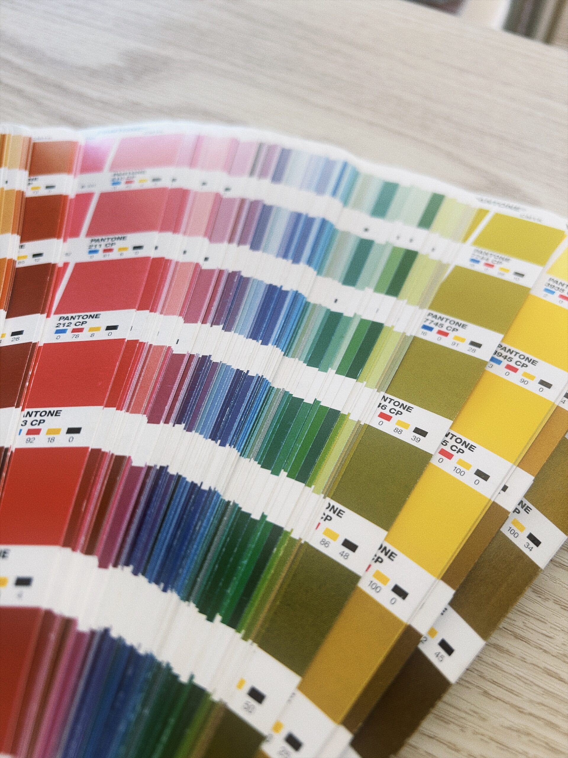
Every Covarra brand package includes a detailed color guide (complete with CMYK, RGB, HEX, and Pantone values) so you always know exactly what to send to your printer, your web designer, or your manufacturer.
For physical product businesses, I always start with CMYK-safe colors. That way, you can use them confidently on your packaging and your digital marketing without worrying about weird color shifts between screen and print. It creates a more cohesive, polished brand experience across every touchpoint.
Your color palette doesn’t just need to look good.
It needs to work everywhere your brand shows up.
If you’re ready for a brand that feels consistent, cohesive, and professionally prepped from day one, let’s work together to make it happen.
CMYK vs RGB: What It Means (and Why It Matters for Product Brands)